INSPIRATION/ RESEARCH
I looked at various gallery identity projects for research and found many interesting and inspirational images. I loved how each designer had a new and exciting concept in mind which addresses the gallery's values and at the same time communicates this to their audience whether through their new logo or the certain colours they have used.
SERPENTINE GALLERY
Directors Julia Peyton-Jones and Hans Ulrich Obrist’s cutting-edge curatorial programme has given the Serpentine Gallery a global reputation, reaching far beyond its Hyde Park location. The gallery needed an identity that would address both its local and worldwide audiences and support the development of more streamlined, cost-effective communications material.
The new Serpentine typeface was a modified version of Monotype Grotesque 215 and 216. Selected for its Englishness – it would not have felt out of place in Hyde Park a century ago – the fonts were redrawn to optimise performance across all gallery communication materials.
In early 2009, 2D barcodes were just coming into use. Recognising that this technology could fast-track browsers to the gallery’s content-rich website, GTF proposed adding a modified code to the identity: a global symbol that would also convey the gallery’s unique location within the greenery of the park. As yet, this proposal has not been realised.


It’s 14 years since Pentagram partner Marina Willer and Wolff Olins chairman Bryan Boylan worked together on the identity for the Tate gallery; now 14 years later they have unveiled their latest collaboration for another stalwart of the London art scene. Their new identity for the Serpentine Gallery was launched to coincide with the opening of the new Sackler Gallery space there designed by Zaha Hadid, and is built around an aperture, which can be used to break typography on posters, signs and in print. The idea is to reflect the Serpentine’s values, which Marina summed up to Design Week as “totally open.”
“They are free to visit and situated in the park, among nature. They are also open in their approach to exhibiting – they’re not just about visual art but about performance, design and other things,” she said.
Ian Osborne has created a new typeface for the logo which aims to be “challenging and approachable; thought-provoking, but also…democratic” while Patrick Giasson was tasked with producing new type for the overall identity which is described as “sharp and modern.” Fellow Pentagram partner Daniel Weil worked on both internal and external signage, incorporating the aperture theme in a number of interesting ways.
Big redesigns like this are certain to split opinion but for our money this is bright, communicative and right on-message. So see you in 2027 Bryan and Marina?


SHANGHAI BIENNALE / SYDNEY PAVILION
The Floating Eye is the curatorial concept for the Sydney Pavilion in the Shanghai Bienale, the largest international art event in mainland China, expected to attract over 8 million visitors. Curated by 4A’s Director, Aaron Seeto, concept presents new and existing works from six contemporary Australian artists, Brook Andrew, Shaun Gladwell, Raquel Ormella, Khaled Sabsabi, Shen Shaomin and Bababa International.
The exhibition encourages an observation of a city’s shifting references and influences, how the overlay of time and history and our emotions and sensations of a place, give meaning and form to our shared spaces. As such the contemporary artists in The Floating Eye hold strong connections with Sydney and offer varied perspectives of the city’s transforming reality observed though its demographics, environment, history, politics, geography and society.
Together the artists in The Floating Eye presents a framework to illustrate how Sydney, and Australia, considers itself within the region and highlights the layering of histories and diverse social and cultural experiences, which speak to the experience of individuals living in global cities such as Sydney.


"How do we discuss the attributes and feelings of a certain place? How do we share those sentiments and effects in a visually meaningful way? In creating a symbols based solution for the Floating Eye, we are really playing with language. A short hand way of describing the key concepts of the exhibition, articulating something that might be difficult to do in words. We are illustrating the interdependence of these key words to a surrounding attitude or culture, and its effect. The symbols are meaningless and meaningful at the same time, it is an interdependence of meaning and pure observation. They become abstractions of the city. Combined, the symbols create an equation:Thing + State <=> effect/ transformed state/ an emotion, a state of being with the result intertwined by an eye – a graphical interpretation of the lens of the viewer." - Creators of the exhibition


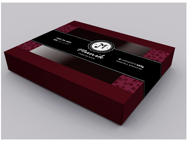
REDESIGN MUNIK CHOCOLATES
This project gave me inspiration too, the designer had to redesign a brand of chocolates called 'Munik', I like show sophisticated it seems and the products created.


TYPO BRANDING PROJECT
This project was part of a larger brief for the fictional Glasgow TYPO talks conference being held at the Lighthouse Gallery and this part involved producing a brochure/magazine for the event. TYPO Glasgow needed to be promoted for its inaugural year so the first requirement was to create a logo and visual identity. This was to reflect its inspiring and eclectic nature, its young and creative approach while incorporating a sense of respect for the craft and skills inherited from the past.
The TYPO International Design Talks is a real design conference taking place every year, held in either Berlin, London or (this year) San Francisco and it is a mecca for designers from all fields. Each year the talks have a chosen theme, 2014’s being ‘Rhythm’ with the aim to explore the cadence of the creative process, the underlying tempo of inspiration, and the beats of the design experience. Speakers have been invited from a broad range of creative industries: thinkers, practitioners, filmmakers, crafts people, typographers and designers to give a good representation of the healthy creative industry of Scotland and a commentary of the current state of graphic design, typography and visual communication.
The TYPO International Design Talks is a real design conference taking place every year, held in either Berlin, London or (this year) San Francisco and it is a mecca for designers from all fields. Each year the talks have a chosen theme, 2014’s being ‘Rhythm’ with the aim to explore the cadence of the creative process, the underlying tempo of inspiration, and the beats of the design experience. Speakers have been invited from a broad range of creative industries: thinkers, practitioners, filmmakers, crafts people, typographers and designers to give a good representation of the healthy creative industry of Scotland and a commentary of the current state of graphic design, typography and visual communication.


The front cover had the TYPO logo laser cut through to give a glimpse of the vivid colours of the artwork behind. The accompanying text required for the front cover was etched also using a laser cutter, this gave a subtle burn and relief, which allows for further play with light in addition to that of the cut out, however does not detract too much attention from the key focus of the TYPO logo.


